Snow-capped mountain peaks, header image for the Skida project

2026 · Skida

HOW CAN WE DESIGN SAFE SOLUTIONS TO STAY PREPARED IN THE MOUNTAIN?

PROJECT OVERVIEW

I helped the team behind Skida, a Norwegian ski touring app, for a short two-week sprint focused on two new pieces of functionality: offline map downloads and pre- and post-departure checklists. Skida helps backcountry skiers plan safer tours by combining 3D maps, avalanche bulletins, weather forecasts, and route planning in one place.

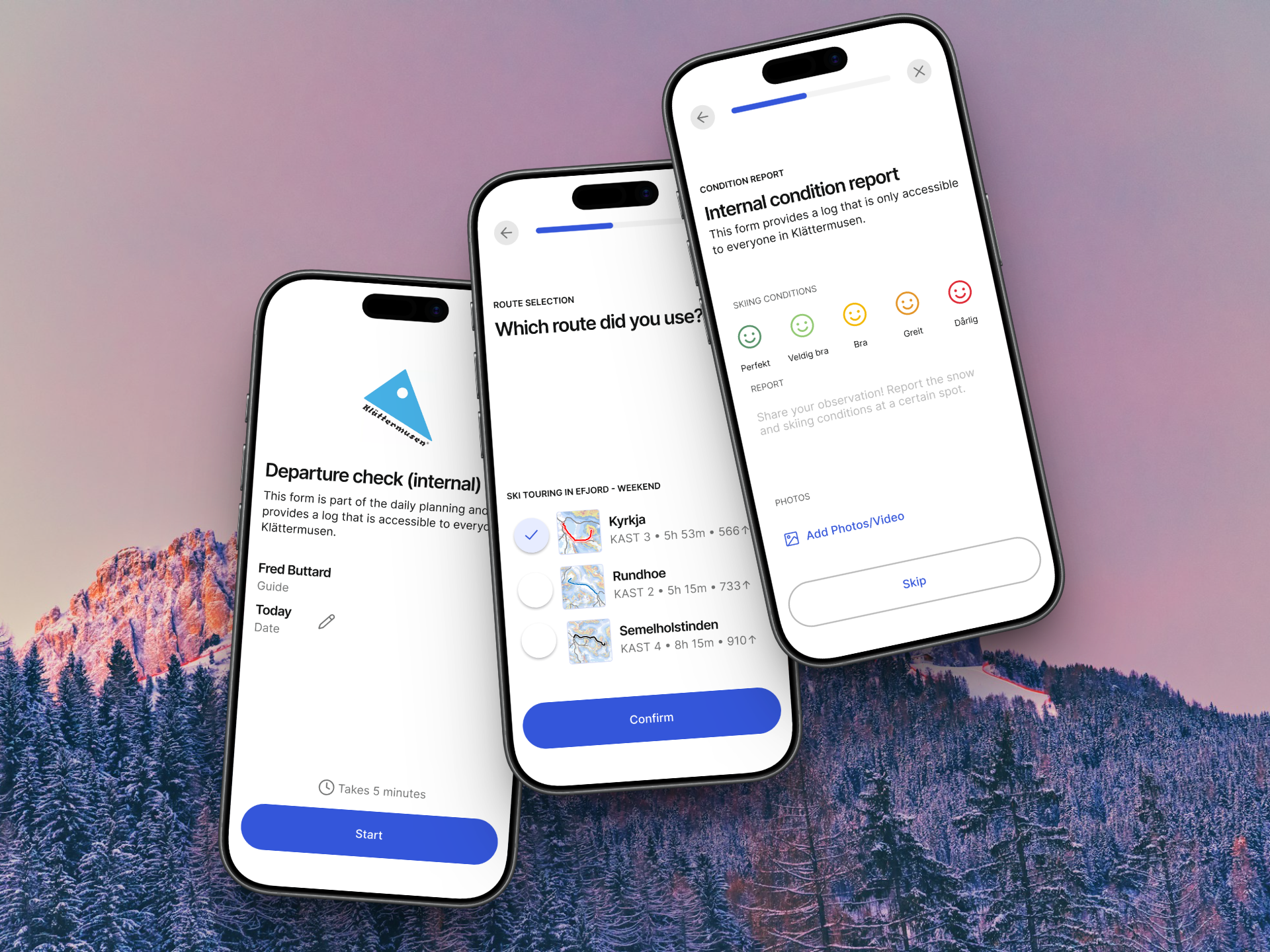
Many ski tours take skiers well outside network coverage, so having route and terrain data available offline is essential rather than a nice-to-have. At the same time, a lot of backcountry safety comes down to simple habits, like checking gear and sharing a route before leaving, and checking in once you're back. My task was to design how both of these could fit naturally into the existing app experience, and to test how well the designs held up once built.

UX Design
UI Design
Figma
Rapid Prototyping
Claude Code
Front-End Implementation
Offline-First Design
Mobile App Design
Feature Design
Ski Touring
Safety UX
Checklists
User Flows
Short Sprint
Outdoor Tech
Iterative Process
Stakeholder Collaboration
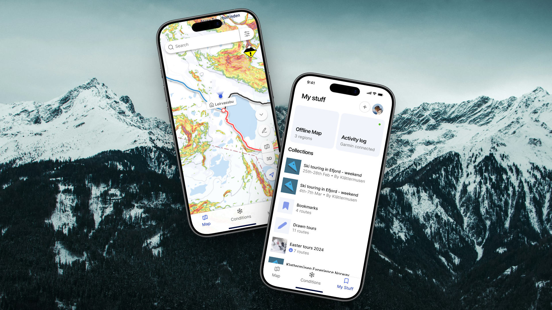
Skida app screens showing the My Stuff page and live conditions map
MY ROLE

I worked as a UX/UI designer, designing flows and interfaces for both features in Figma and testing their front-end implementation using Claude Code.

DURATION

2 weeks · 2026

LOCATION

Remote

CORE OBJECTIVE

Design offline map access and departure checklists for backcountry skiers

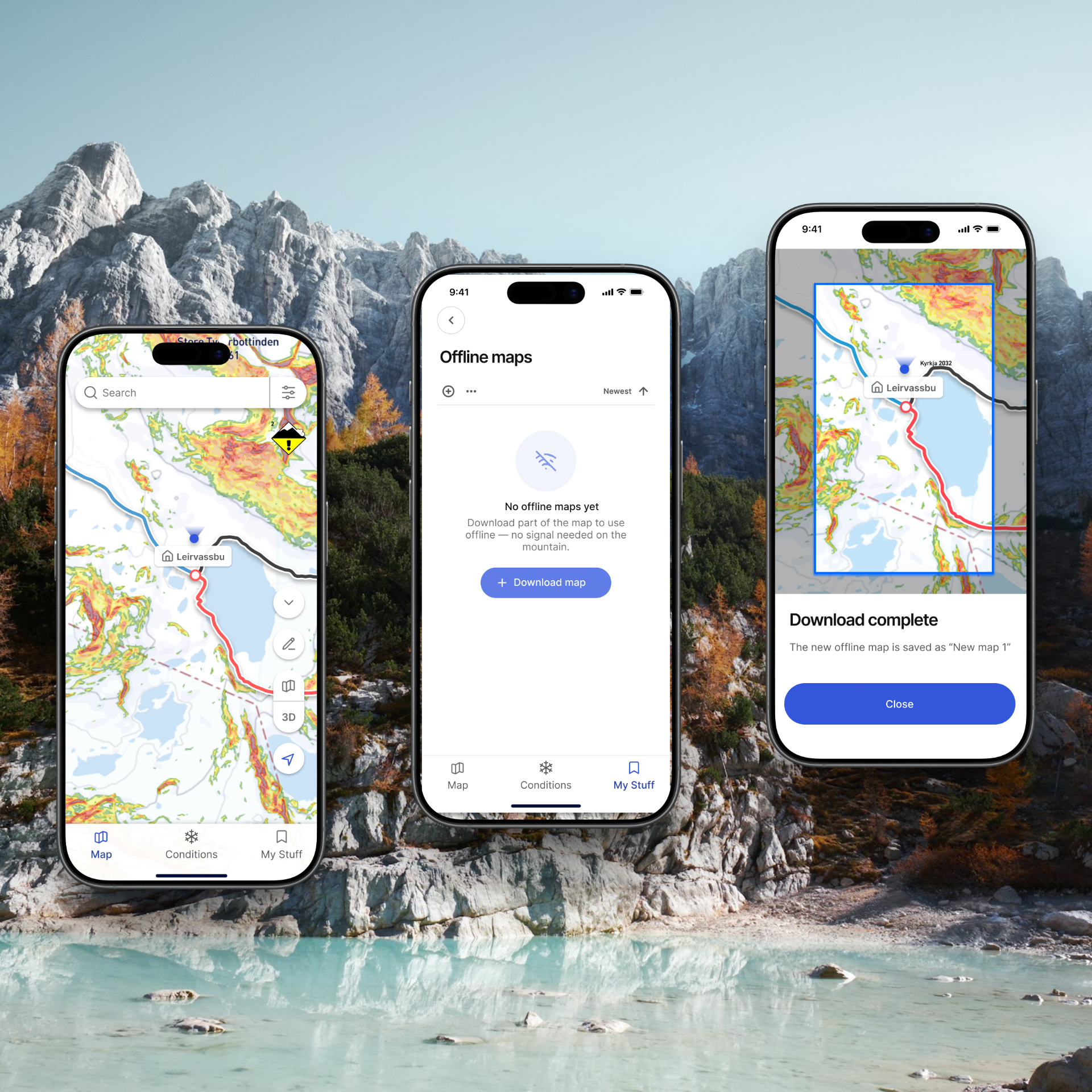
Skida's mission is to help skiers plan smarter and get home safely, and both new features tie directly into that. Offline maps mean skiers can rely on their route and terrain data even in the dead zones common in the mountains, while pre- and post-departure checklists build in the kind of safety habits, like checking gear, sharing a route, and checking in on return, that are easy to skip when you're eager to get moving.

I was tasked with mapping out how users would download and manage offline map areas, and how a lightweight checklist could sit at the start and end of a tour without adding friction to the planning experience people already relied on.

Skida offline map download flow on mobile

Swipe to explore the process →

Step 1

Explore & Map

With only two weeks to work with, I started by quickly getting familiar with the existing app and where the two new features could fit into the current experience.

  • Reviewed the existing app and its Figma design library to understand current patterns and constraints
  • Mapped out where in the user journey offline downloads and checklists would create the least friction
  • Sketched early flows for both features
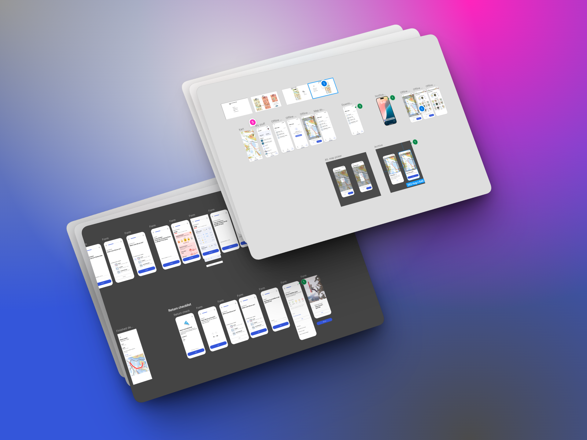
Figma boards mapping out the offline map and checklist flows early in the sprint

RESULTS AND IMPACT

Over two weeks, I delivered Figma flows and UI for offline map downloads and pre- and post-departure checklists, along with a tested front-end implementation that helped validate the designs' feasibility ahead of development.

Since the collaboration was short and the features are still moving toward release, I can't share every detail of the final implementation, but the goal throughout was to give the Skida team a validated foundation they could build on directly, rather than designs that still needed to be re-tested from scratch.

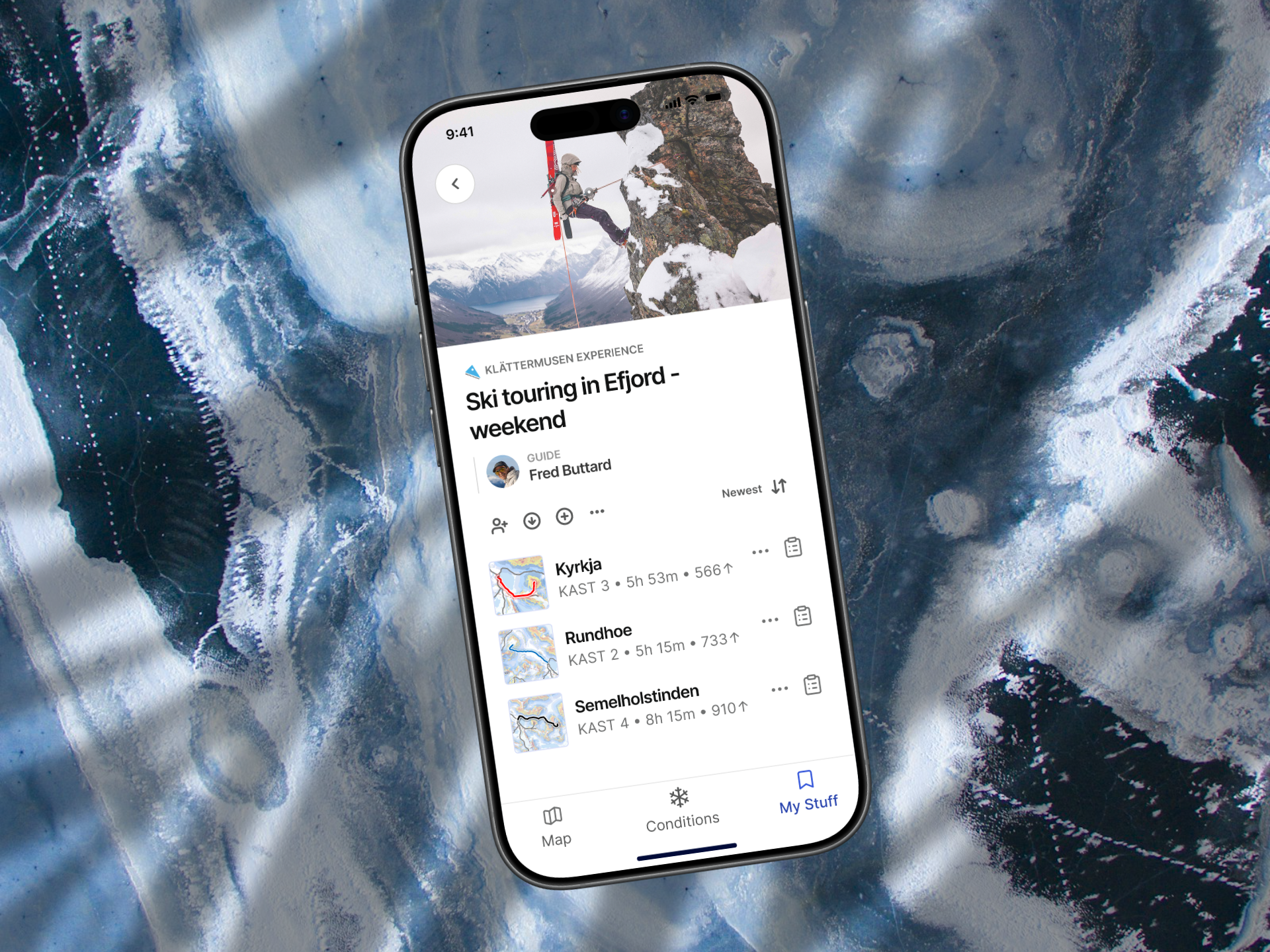
Finished trip detail screen in the Skida app, showing route list and guide information
A ski tourer standing alone on a mountain ridge, illustrating a key lesson from the Skida project

Lessons learned

What this project taught me

Working on such a tight two-week timeline reinforced how valuable it is to validate ideas quickly rather than polish endlessly. Testing front-end implementation directly with Claude Code, alongside Figma prototyping, helped me and the team see sooner what would actually work technically, instead of relying on assumptions from static designs.

It also gave me a better appreciation for designing "invisible" safety features. The checklist flow in particular needed to feel quick and unobtrusive, not like another task standing between a skier and the mountain, while still being valuable enough that people would actually use it.

Key takeaways from the project

SPEED FORCES CLARITY

With only two weeks, there was no room for scope creep. Every design decision had to directly serve offline access or the checklist flow.

SAFETY UX MUST STAY LIGHT

Checklists only work if they don't feel like a chore. Keeping the before/after flow short was as important as what it contained.

PROTOTYPING CODE SPEEDS UP VALIDATION

Testing implementation in Claude Code alongside Figma made it much faster to catch what wouldn't hold up in practice.