Museum-inspired project hero image

2024 · Istituto Europeo di Design

What makes a good museum?

Redesign of L’Antropologico

As part of a summer course at Istituto Europeo di Design in Florence, I joined an international team to redesign the Museum of Anthropology, L’Antropologico. The museum held rare and fascinating cultural artifacts, but the visitor experience felt outdated, fragmented, and difficult to connect with.

Our goal was to make the museum more engaging, accessible, and relevant to a broader audience through a clearer visual identity, stronger storytelling, and a more coherent spatial experience.

Coming from a UX background, I had to find my footing in a team shaped largely by graphic design perspectives. That challenge became one of the most valuable parts of the project, teaching me a great deal about visual communication, collaboration, and compromise.

Graphic Design
Typography
Layout
Color Systems
Theming
Project Planning
Museum Research
Photoshop
InDesign
Illustrator
Project image for the L’Antropologico redesign
My role

I worked in an international team with two other students from Sweden and the USA. We all contributed across the redesign process, and I worked hands-on with concept development, layout, typography, and visual direction.

Duration

Summer 2024

Context

IED Florence · Summer Course

Why redesign?

A museum with rare artifacts, but a weak visitor experience

The Museum of Anthropology in Florence contains rare exhibits connected to cultures and communities from across the globe. Yet when we visited, the museum felt dark, dated, and difficult to navigate. Mismatched labels, aging visual elements, and limited contextual information made it hard to stay engaged.

Even during peak tourist season, the museum saw very few visitors. We wanted to explore how a redesign could help the museum attract more people, keep visitors interested for longer, and make the content feel more accessible and relevant to a wider audience.

Visual material from the museum redesign project

Swipe to explore the process →

1) Researching

Learning how the museum worked — and where it failed

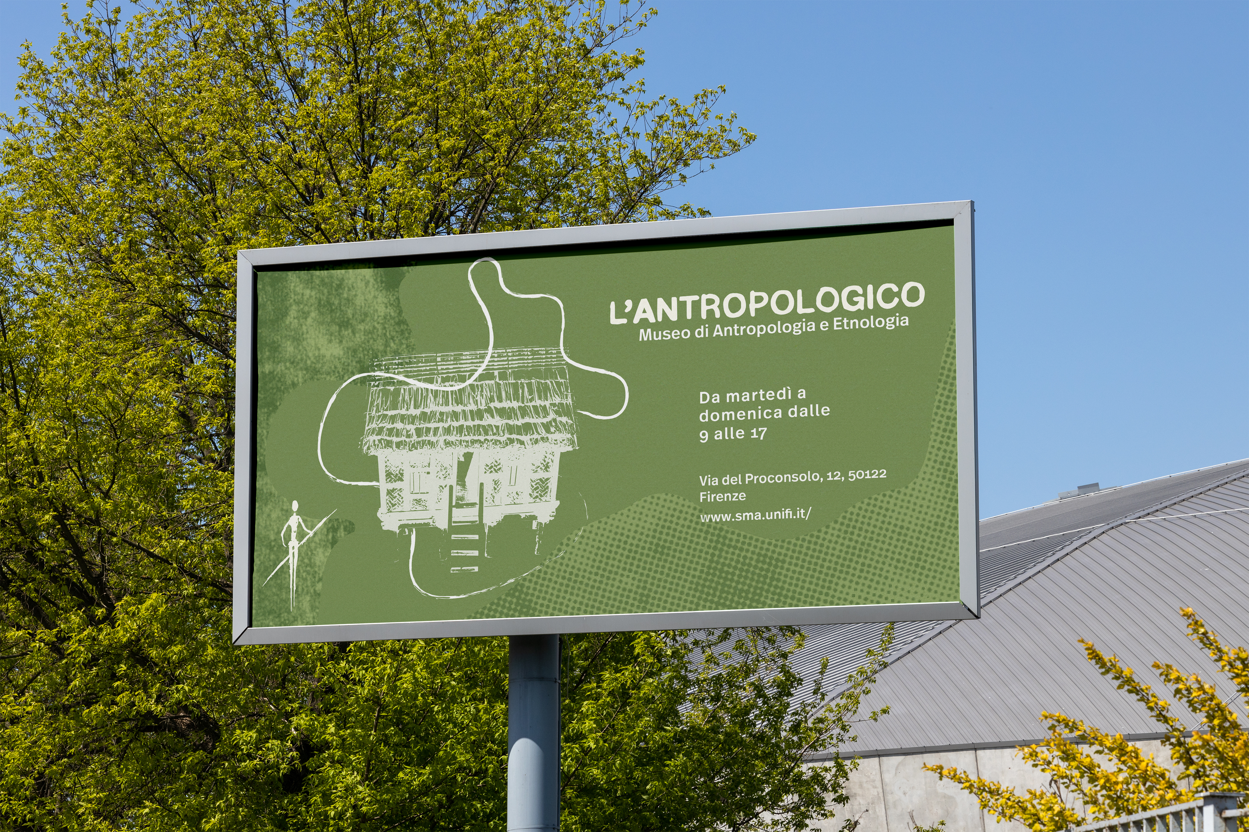
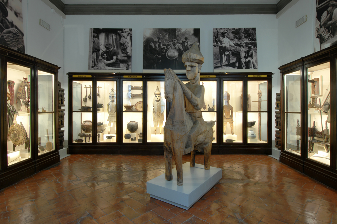
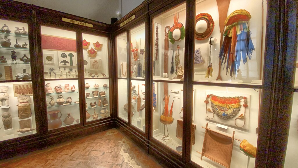
We visited the museum multiple times, documented the experience through observations, notes, and photographs, and spoke with visitors and staff when possible. We also researched museum design, wayfinding, universal design, and the history of anthropology museums to understand how L’Antropologico could become more engaging and legible.

Research and references for the museum redesign

Outcome

The project resulted in a complete redesign concept for L’Antropologico, with a stronger visual identity and a more engaging visitor experience. Our proposal focused on making the museum easier to understand, more visually cohesive, and more inviting to new audiences.

  • A new visual direction for the museum
  • Concepts for posters, signage, and wayfinding
  • A final presentation shared with IED and the museum

For me, this project was especially valuable because it challenged me to work across disciplines and contribute in a design environment that was very different from UX. It strengthened both my visual communication skills and my ability to collaborate through disagreement and uncertainty.

Presentation material from the museum redesign
Illustration representing lessons learned from the museum redesign

Lessons learned

An interdisciplinary project that pushed me in new ways

This experience taught me a great deal about interdisciplinary collaboration and the importance of staying open to unfamiliar processes and perspectives.

At first, I found it challenging to work closely with graphic design students who used a different design language and had different priorities than I was used to from UX. Over time, though, we learned how to communicate better, trust each other’s strengths, and build a concept we were all proud of.

Key takeaways from the project

Working across disciplines

I learned how important it is to adapt my way of thinking and communicating when collaborating with designers from other fields.

Finding common ground

We disagreed a lot in the beginning, but once we aligned on a shared visual direction, the collaboration became much stronger.

Blending UX and visual storytelling

The final concept was stronger because it combined user-centered thinking with a more expressive and graphic approach.